In this article
Five AS-OCT pretraining runs share an image corpus and an encoder initialization. On the monitoring dashboard, their representation curves move in different directions. JEPA spreads variation across more directions; two patch-limited MAE variants concentrate it into fewer. It is tempting to read those curves as a ranking.
To interpret the curves, I start with the measurement: which images, which features, and which mathematical summary?
This note works through the dashboard snapshot recorded on 1 October 2026 at 00:15 CEST, accompanying my research update. It connects data selection, representation geometry, and training performance while keeping their conclusions separate. The five-recipe article describes the experiments themselves. Here, I want to explain what the dashboard adds.
The quality filter defines the experiment
An anterior-segment OCT B-scan is a cross-sectional image of the front of the eye. Before pretraining, we filter the available scans using a logistic model built from 31 image- and mask-related variables. Its score runs from zero to one; higher scores rank an image as more likely to be unsuitable.
The retained index requires a score strictly below 0.85. Moving the exclusion threshold from 0.95 to 0.85 removed another 12,323 B-scans, about 0.35% of the original corpus. The total excluded became 48,449 out of 3,475,579, about 1.39%, leaving 3,427,130 images.

- Below 0.85: retained
- 0.85–0.95: 12,323 additional exclusions
- 0.95–1.00: 36,126 already excluded
Each bar is a percentage of the original corpus. Its height is on a log scale; bar areas cannot be read as the excluded fraction. The full retained index contains 3,427,130 images.
Open the full-size figure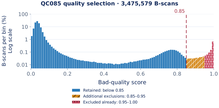
The histogram makes the selection rule inspectable. It cannot tell us whether every excluded scan is poor or every retained scan is useful. This is an uncalibrated ranking score: 0.85 does not mean that an image is “85% bad.”
A small overall exclusion rate can also be concentrated in particular acquisition conditions. The scientific question includes which images change membership, not only how many. All five runs use the same retained index, so this particular selection decision is shared.
Turn image representations into a spectrum
The monitor periodically evaluates 256 fixed B-scans from the pretraining population. It reduces the full raster by three, without augmentation, and averages patch-token features after the encoder’s final LayerNorm. This produces one 1,024-dimensional vector per image, before any projector or decoder.
Those vectors are centered across images to calculate covariance, without L2-normalizing each vector. Its eigenvalues, written as λ₁, λ₂, and so on, describe how much variation lies along each principal direction.
PC1 concentration is the share assigned to the largest eigenvalue:
PC1 share = largest λ / sum(λ)
Participation ratio, or PR, summarizes how many directions contribute substantially:
PR = sum(λ)² / sum(λ²)
If four directions each have variance one, PC1 explains 25% and PR equals four. If their variances are instead 7, 1, 1, and 1, PC1 explains 70%, while PR is 100 / 52, about 1.92. All four directions still vary, but one dominates.
The implementation calculates the ratios from squared singular values of the centered feature matrix; the common covariance scaling factor cancels. PR is therefore an effective dimension, not a count of nonzero coordinates. An embedding can have hundreds of coordinates and a much smaller participation ratio. With 256 centered observations, this measured covariance has rank at most 255, even though the vectors have 1,024 coordinates.
Both expressions assume positive total variance. If every representation is identical, that denominator vanishes. A monitor needs to detect this degeneracy explicitly rather than report an ordinary ratio. Representation norms and nonfinite outputs also need their own checks.
Read the snapshot with its checkpoint positions
The reference is the ImageNet-pretrained MAE checkpoint used to initialize the encoders. It is not a randomly initialized network. These experiments continue pretraining from an existing representation.
- Full-field MAE
- Matched Global
- Matched CUNEX
- DiffMAE 2D
- JEPA + VISReg
- ImageNet-MAE initialization
Participation ratio

Variance explained by the first principal component

Snapshot recorded on 1 October 2026 at 00:15 CEST. JEPA's latest diagnostic is at 52,500 updates; the other curves end at 150,000. The grey line marks the ImageNet-MAE reference. Points are connected without smoothing or extrapolating the unfinished run.
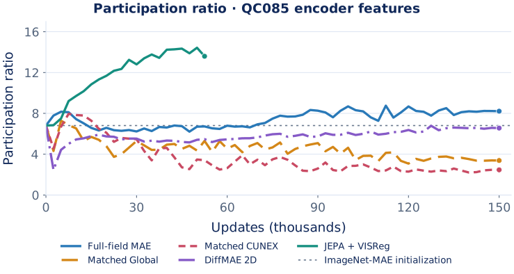
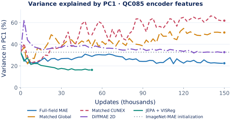
| Encoder or run | Updates in snapshot | Participation ratio | PC1 share |
|---|---|---|---|
| ImageNet-MAE initialization | 0 domain updates | 6.81 | 32.7% |
| Full-field MAE | 150,000 | 8.21 | 22.5% |
| Matched-Global | 150,000 | 3.38 | 50.9% |
| Matched-CUNEX | 150,000 | 2.47 | 61.8% |
| DiffMAE 2D | 150,000 | 6.56 | 32.7% |
| JEPA + VISReg | 52,500 | 13.59 | 16.3% |
Full-field MAE has less concentrated variation than its initialization under this diagnostic. The two matched-patch arms have more concentrated variation. DiffMAE is close to the initialization on these summaries. JEPA has the highest PR and lowest PC1 share of the displayed checkpoints.
These are comparisons of the observed feature spectra. Evaluating their usefulness for diagnosis is the next experiment.
Similar PR and PC1 values also do not mean two encoders produce equivalent representations. The statistics discard information about what the directions represent and how individual images are arranged. Two models can have similar spectra while encoding different distinctions.
JEPA is only at 35% of its planned update budget here. Comparing it with the completed 150,000-update arms describes the displayed checkpoints; it is not a matched-endpoint experiment.
A direction is not a clinical concept
A principal direction has no diagnosis attached to it. It may reflect anatomy, scanner characteristics, background, alignment, or several factors mixed together.
More directions can preserve useful distinctions. They can also preserve variation irrelevant to the downstream task. Conversely, a task might depend on a distinction that occupies little of the total variance.
This is why I would describe the matched-patch results as representation concentration on this panel. “Partial collapse” can be a useful hypothesis, but the plotted ratios do not establish which information was lost, whether local features behave similarly, or whether a particular diagnostic task became harder.
One possible explanation is that the restricted patch budget supplies too little context under this recipe. Testing that hypothesis means changing context or patch budget in a controlled comparison, then checking both representation behavior and task performance.
The experiment cannot identify the cause from a curve alone. Mask placement, image geometry, the reconstruction target, optimization, and the diagnostic’s own input preparation all deserve examination.
JEPA’s regularizer belongs in the interpretation
The local JEPA recipe explicitly uses VISReg to influence representation geometry. The monitor reads encoder features before the projector, whereas the regularizer acts after it.
That separation matters, but it does not make the monitor independent of the objective. Gradients from the regularized projection train the encoder too. A more dispersed encoder representation is therefore compatible with what the objective encourages.
The higher PR is an observation worth investigating. It is not an independent demonstration that JEPA has learned more clinically useful information.
The five arms also differ in objectives, masking, view geometry, and computational cost. JEPA uses global and local views; the reconstruction arms solve different prediction problems. Their loss values are not interchangeable units of progress. A smaller number on one loss curve cannot settle which encoder is better.
A training panel has a specific role
The fixed panel comes from the pretraining population. Its job is to detect and explain changes during training. It is not an untouched test set.
Reusing the same images helps distinguish encoder changes from changes in the sampled population. It also limits the population represented. Repeatedly looking at the same panel does not create new independent evidence.
This distinction becomes practical when selecting checkpoints. A representation diagnostic can flag a run for investigation. To select an encoder for a clinical task, I need a defined development procedure and an evaluation boundary that remains separate from those choices.
Patient grouping matters here. Multiple scans, examinations, and eyes can belong to one person. Splitting images without respecting that relationship can make a model appear to generalize while it encounters closely related material on both sides of the split.
Progress does not establish convergence
The planned budget is 150,000 updates with 64 source images per update: 9.6 million presentations, or about 2.8 passes over the retained image index. Multiple views increase computation; they do not multiply the number of source-image passes.
Finishing that schedule establishes that a run completed its assigned budget. It does not establish that the representation has converged or that extending training would help.
In particular, a recent DiffMAE trend cannot justify saying that another half-epoch will overtake the initialization. Curves can flatten, reverse, or keep changing while downstream performance does something else. A useful extension would compare checkpoints under a declared development protocol.
Budgets from other papers also need their original context: dataset size, initialization, architecture, views, objective, and evaluation. A large epoch count elsewhere is not a requirement demonstrated for this corpus.
Profiling explains where the compute goes
I also profiled the execution behind the training runs. After optimization, the two-GPU JEPA implementation showed GPU-compute-dominated execution in its 30 September qualification.
Getting there required finding an avoidable wait. The trace initially pointed to communication, but the delay came from input preparation arriving late. Overlapping that preparation with current GPU work reduced the stall. Gradient, optimizer-state, and resume checks established equivalence in the qualification comparisons.
The optimized trace at update 47,323 showed about 7.9 seconds of GPU kernels excluding NCCL on each GPU, roughly 90% of the profiled step. The rank-zero all-gather kernel duration had fallen to about 36 milliseconds. No other large, isolated, avoidable delay was identified in that window.
The elapsed-time result comes from a separate, unprofiled ABBA measurement: 10.246 seconds per update before the change and 8.787 afterwards, about a 14.2% reduction. That timing includes input waiting and the optimizer step, but excludes periodic diagnostic and checkpoint work. The trace explains the bottleneck; the unprofiled comparison measures the improvement.
An earlier Nsight capture on 26 September provides a complementary, kernel-level result. ML Training Monitor classified all eight inspected BF16 matrix-multiplication launches as compute-bound from measured compute and memory throughput. That classification concerns those sampled kernels; the later JEPA timeline describes the optimized training step.
The near-99% activity is part of this picture. The profiler evidence is what supports the compute diagnosis. These measurements help make the experiment feasible while keeping execution efficiency separate from what the encoder learns.
What the next experiment needs to answer
The dashboard has given us concrete questions: why do the matched arms concentrate, which distinctions survive in their features, and does JEPA’s more dispersed representation transfer usefully?
A common downstream protocol can address those questions using the same task definitions and patient boundaries. A frozen-encoder probe can examine what the representation makes accessible; fine-tuning asks how it adapts under another training procedure. Their results should remain distinct.
The prepared pools at this stage contain 562 development patients with 23,891 B-scans and 140 reserved patients with 6,142 B-scans. These are available pools, not completed supervised results; task-specific counts may be smaller once labels and eligibility are finalized.
The final evaluation should be reserved for a comparison whose selection rules have already been established. Discrimination, calibration, subgroup behavior, and uncertainty then become task-specific quantities we can actually measure.
For this snapshot, the result is a map of representation behavior and a set of testable explanations. That is enough to guide the next experiment without asking the dashboard to stand in for it.
Data and measurement record
The figures use the saved aggregate snapshot from 30 September 2026, 22:15:56 UTC (1 October, 00:15:56 CEST). JEPA had progressed beyond its last diagnostic when the snapshot was taken; its representation curve correctly stops at the recorded 52,500-update measurement. Later training progress is not appended to this dated note.
Download the aggregate figure data and definitions. The file contains histogram counts, spectral summaries, and measurement scopes. It contains no patient identifiers, individual feature vectors, or OCT images.
The compute discussion uses two separately dated records: the 26 September Nsight kernel capture and the 30 September two-GPU optimization qualification. Their sanitized measurements are in the profiling summary. Kernel attribution and useful-throughput estimates have different denominators; see the Nsight Compute profiling guide for the hardware-counter definitions.
The monitoring workflow is available as ML Training Monitor. A 48-second demonstration shows the software using synthetic telemetry.